Having upgraded a few machines to Ubuntu 9.04 a few days ago, here are my thoughts on this latest version:
Things I Love
The speed of the system – both in booting and in general use – seems to be faster. There’s more of a delay after logging in before it draws my desktop, but when it does the system is immediately usable. Previously the desktop appeared quickly, but it would take a few seconds longer before the panel applets were drawn and the system could actually be used.
Things I Hate
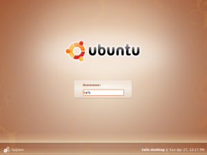
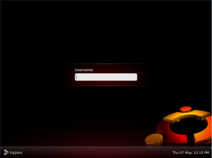
The artistic direction of 9.04 leaves something to be desired. The primarily dark login screen is intimidating, rather than friendly and welcoming. Yes it can be changed easily, but it’s not the sort of thing that will encourage a novice user


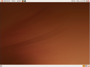
Similarly the default desktop image is dull. It looks like someone took a blue wavy-line desktop image off an Apple machine, and converted it to brown. The best thing that can be said for it is that it’s inoffensive. The Hardy Heron desktop image was daring and imaginative – and beautiful enough as a work of art that I bought the T-shirt. The Intrepid Ibex image was a bit too abstract – with many comments that it looked like a coffee stain (rather than the Ibex it was supposed to be). But even that was more interesting and inspirational than a few wavy lines.


While I’m on the subject of desktop images, why does Jaunty have packages for “edgy-wallpapers”, “feisty-wallpapers” and “gutsy-wallpapers” but no sign of “hardy-wallpapers” or “intrepid-wallpapers”?
Things I Just Don’t Understand
Since the first version of Ubuntu, five years ago, the “Log Out” and “Shut Down” options have been available from the System menu. Now they’re gone. Sort of. Depending on whether or not you’re using the “User Switcher” applet.
That’s right – the presence, or absence of some key menu items, which muscle memory has trained me to look for in the same place over the past five years – is determined by whether or not you want to switch users from within a running session. In what universe does that make sense?
The logic seems to be this: the User Switcher applet offers Log Out and Shut Down options on its menu; therefore to avoid duplication/confusion, when the User Switcher applet is present those options should be removed from other parts of the user interface.
What I don’t understand is why I can’t have both. Why can’t I shut down from the System menu most of the time, as I’m used to doing, but still have the ability to switch to a different user from time to time? Why can’t I log out from the System menu if my mouse is close to it, or log out from the user switcher if my mouse is closer to that?
To make matters worse, the icon on the User Switcher applet tends to change. This is what it looks like with my normal settings (there’s also an option to show your name instead of the little person icon, but as I already know my name, I prefer it to take up less screen space instead):
See, a little red icon that contains a well known symbol denoting power controls. A new user might not spot it as a means to log out quite as quickly as a sweep through the menus, but at least when they do spot it they’re likely to remember that they need to click on the red power button to log out.
Now look what happens when I do something that’s largely unrelated to logging out or shutting down: I’ll launch Pidgin, the instant messaging (IM) client shipped with Ubuntu:
The “power” icon has now been replaced with a green circle, indicating my IM status. If my IM status changes, so does the icon. So for any user who wants to have the User Switcher applet, and who also runs Pidgin, the options to Log Out or Shut Down are hidden behind an icon whose colour and shape changes based on instant messaging settings. That’s nice and user friendly, isn’t it. Whatever happened to the principle of least surprise?
If the Log Out and Shut Down options were also still present on the System menu, this wouldn’t be so much of an issue. Users who are thrown by the changing state of the User Switcher icon would soon learn to use these functions from the System menu instead. Those old Ubuntu hands whose muscle memory still sends them to the System menu wouldn’t be surprised by the absence of the Log Out and Shut Down options.
By all means expose common functionality like this in more than one place, but please don’t expose it in one place if you’ve got an applet installed, and another if you haven’t. And please don’t make the one place that it’s exposed also be an icon whose shape and colour can change frequently, depending on the state of yet another application. If you want to confuse new users that’s a good way to go about it.
I share a lot of your opinions here. (Surprised I’m the first one to comment!) Except I really do like the default wallpaper on Jaunty. Maybe not as interesting as the Hardy design, but I think it’s elegant. Cheers!
I don’t actively dislike the wallpaper – I just think it’s a slightly uninspired choice. The previous animal wallpapers had the potential to become one of Ubuntu’s trademark elements. In the same way that you can spot a default Windows XP installation from 20 paces due to the Tellytubby rolling fields on the desktop, a series of animal wallpapers could have continued to define and identify a Ubuntu installation (or Live CD) and distinguish it easily from its peers. Instead the distinguishing feature of the wallpaper is simply its brownness.
It’s not bad. It’s not inelegant. It’s not ugly. It’s just a wasted opportunity, I think.
I don’t find the login screen intimidating or ugly… To me it looks very elegant! I guess it now simply appeals to different people. But even though I like the design, I don’t mind if it keeps changing.
I happen to agree on the wallpaper, I always liked the more daring ones. But wallpapers can be changed (It’s usually the first thing you do when customizing your shell) and ubuntu’s not that widely used that you could be annoyed by seeing a bad wallpaper everywhere.
I just wish ubuntu didn’t keep reordering my launch bar for no obvious reason…
Yes it’s quite easy to change the wallpaper – the option even appears on the desktop’s context menu, where a lot of Windows users would expect to find it. It’s also fairly easy to change the GDM theme to alter the appearance of the login screen – but the controls are a little harder to find, and users coming from a Windows background might not expect to even have that option.
Even though both these things are easy to change, I think it’s important to have default settings that are appealing to new Ubuntu users, most of whom will be coming from a Windows background. Sparse, dark themes and backgrounds tend to give a more geeky and technical feel to a system, whereas light colours make it feel more open and welcoming. I strongly believe that there should be a dark theme available as part of the standard installation, but I still feel that the default setting should be more bright and inviting.
But of course, it’s all down to personal opinion – and the great thing about Linux is that you can readily tweak and change it to suit your own taste.
Of course the desktop wallpaper is worth spending huge amounts of text on (being a bit sarcastic..), but the missing logout entry is _definitely_ a poor decision: as a long-term Ubuntu user I keep hitting “About Ubuntu”, even weeks after an upgrade! I hope that the Ubuntu developers read this blog and will reconsider this.
Mmm… of course you can always search a little more (a I just did): http://ubuntuforums.org/showpost.php?p=7256305&postcount=7
Or you could just read my next post which also would have told you the same thing.
As for the amount of text spent on the wallpaper – maybe it is excessive, but going back to such an uninspired image just felt like such a regression after Intrepid’s and especially Hardy’s wallpapers that I thought it was worth drawing attention to. Hey, it’s my time to waste 😉