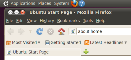
There has been a lot written about the change in position of the window controls in the alpha- and beta-releases of Ubuntu 10.04, Lucid Lynx. I haven’t really got much to add that’s not in this excellent post, and it’s already been discussed to death in this bug report. Basically the problem is that the window controls have been moved from their historical position on the right of the title-bar (where Windows also has them), over to the left:
The rationale behind the change – what there is of it – seems to be that the Ubuntu developers have some ideas for things that they want to put in the top-right of the window. I’ve always felt the window title bar to be a bit of a waste of screen space; I don’t want to see it removed entirely, but rather would like to see it gain some more useful functionality. For example, the window title on Apple’s Finder can also be used to navigate to parent directories, or as a drag-and-drop widget for the parent folder.
So I’m definitely not averse to them adding more power to the title bar, but why does that require the widow controls to move now? Why does it require them to move at all? Unless they’re going to magic some extra space from somewhere, I don’t see why the window controls can’t stay at the top-right, and the new widgets go to the top-left, or to the right of the title bar but just left of the window controls. There may be a very good reason why their new widgets should go to the top right, but with no indication as to what those new widgets might be, it’s a little hard to judge.
So what’s this got to do with the Dell Mini 10, specifically? It’s all about the trackpad.
I have a Mini 9, which I think is a great machine. It has a traditional old-fashioned trackpad, with a pair of buttons underneath it for left- and right-clicking. At the weekend I was working on a friend’s Mini 10, which has the buttons integrated into the trackpad itself. The result was that almost every time I tried to click, the mouse pointer would jump down the screen a little, often meaning I missed the target I was aiming for. Although my friend (who has owned the machine for a few months now) fared much better, even he had more mis-clicks than I would consider reasonable.
I’m not averse to integrated trackpad-and-button systems per se. The recent multi-touch trackpads on Mac laptops seem to work quite well in this regard – perhaps because the whole trackpad is a button, so there’s no need to move your finger away from the target to initiate a click. That’s not the case with the Mini 10: you always have to move your finger to the “button” area at the bottom of the trackpad, but doing so is liable to be interpreted as a desire to move the cursor. It also prevents the “move with the finger, click with the thumb” approach to trackpadding that I prefer. This isn’t the only machine I’ve ever used with such a troublesome trackpad, it just happens to be the most recent.
These jumpy mouse-clicks are problematic enough when window controls are at the right, but putting them on the left makes them a prime target for mis-clicks every time the user tries to open the Applications menu. Apart from the claim of mystery widgets in the future, I have yet to see a good reason for moving the window controls, while I’ve seen plenty of good reasons to keep them where they are. The Mini 10’s trackpad is just another one to add to a long list.

The trackpad issue is software all the way. Using sticky backed velcro (soft side of it) and sticking it on the buttons area will remove the misclicking completely.
I have complained to Dell and many others have too. Dell just doesn’t care to get the driver written proper.(or the trackpad creator doesn’t care)