I’ve mentioned Flattr on this blog before, and now that I’ve been using it for a while I’d like to suggest some changes to the Flattr “Dashboard” which might make more effective use of the screen.
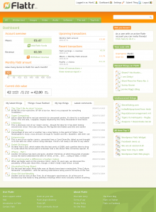
I would imagine that many Flattr users treat the Dashboard as their “Home” page on the site. It provides a quick overview of any recent flattery you may have received, shows you how dilute your own flattery is, and provides a few links to help you discover things to flatter. Here’s how it looks (click for the full sized version):
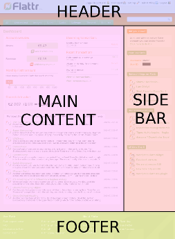
The site is fresh and modern, with a familiarly blog-like design which partitions it into the four commonly used sections of a Header, Footer, Main Content Area and Sidebar:
I’m specifically not going to talk about the Header or Footer areas. I’m just interested in the real meat of the page: the Main Content and the Sidebar. I’m also not going to suggest any radical changes to the content of these areas. I’m just going to suggest some ways in which they could be made more beneficial to a Flattr user without having to go so far as a radical redesign.
Main Content Area
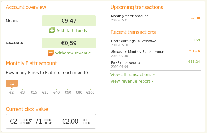
Let’s get started with the Content Area – specifically the panel at the top:
There are three particularly useful sections in this panel: your Means, your Revenue, and the Current Click Value section. Keeping the Means and Revenue large and obvious is a good idea as it lets you immediately see whether you need to top your account up, and whether you’ve received some money to withdraw or transfer in the past month. The Current Click Value shows your Monthly Flattr Amount, the number of things you’ve flattered and as a result the value of each of those clicks.
What about the rest of the panel? The Monthly Flattr Amount section is completely redundant as a source of information as you can see the figure in the Current Click Value area. Yes, it also acts as a control to let you change your monthly Flattr amount, but do people really change this value often enough to warrant giving it so much space every time they visit the Dashboard? Better to turn the Current Click Value into a button or link which will reveal this control when clicked.
As for the Transactions sections, I would wager that most people only have a few transactions each month so don’t need to see the details on every visit. How about making this show just the date and value of the most recent transaction and the next upcoming one – the “View all transactions” link is still there if you want more details.
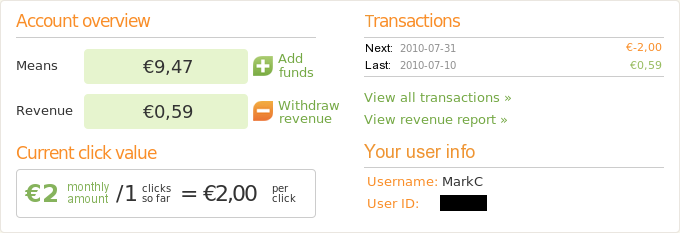
A bit of work in The GIMP to apply these suggestions results in the image below. It’s still got the same basic layout as the current version, but with less redundancy and just the relevant details shown. All the other information and controls from the original panel are still available via links or slide-out controls. You’ll notice that I’ve also filled up the space in the bottom right with a “Your user info” section, taken from the sidebar to free up a little more space there.
This version of the top panel only takes up about half the vertical space of the original design, but still offers the same functionality. That extra space can then be used to show more items in the tabbed lists at the bottom of the content area. On the subject of those lists, while I can understand showing two lines of the description for items in the “Things I have Flattred” tab, it seems a little excessive in the “My latest things” and “My top things” tabs. They’re listing my things – I don’t really need much description to remind myself about them. Cut that down to a single line and you can fit more items in.
So we’ve reduced the size of the top panel, resulting in more space for the bottom panel. And we’ve reduced the size of each item in the bottom list. Together these changes will free up the space to show a few more items in those bottom lists… but where are the “Show all” links? It would be nice to be able to open to an extended view of each of these lists rather than just losing things off the bottom as new entries appear at the top.
Sidebar
There are five panels in the sidebar, so let’s just deal with them one at a time, starting from the top…
Did you know?
Did I know that I could invite friends to join Flattr? Why yes I did, because you tell me that every single time I access my Dashboard. If you must have a box like this, at least vary the tips from time to time. Better still lose the box altogether, or just show it occasionally as a reminder.
Your user info
I’ve already dealt with this one by moving it to the Main Content Area. Even without any of the other changes I’m suggesting here, there’s plenty of space in the existing design to move this information across. It doesn’t serve any real purpose living in the sidebar, so move it or get rid of it to free up some space.
Newest things on Flattr
Undiscovered things
I’ll deal with both these as one entry as they’re similar. “Undiscovered things” shows Flattr users’ submissions that haven’t yet been flattered at all. It can be a great way to discover interesting and underrated sites… but it can also reveal that there’s a reason why some things never get flattered 😉
I’m not quite sure what “Newest things” shows. All the entries here usually have just a few flattrs, so I don’t think it’s as simple as “most recently flattered” (otherwise more popular things would show up too). However they populate this list, it’s another good way to discover items that you might not otherwise have stumbled across.
Both these lists are great when you’re in a random browsing mood – except for the fact that they’re too short. These should both be doubled to show 10 items.
All time top 5
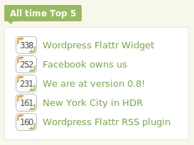
At the time of writing, the list looks like this:
This is actually quite a shocking image because, for the first time in weeks, the number 4 and number 5 spot have swapped position! Other than that, this list has been pretty much the same for as long as I’ve been a Flattr member. There’s a positive feedback mechanism at work here: the top rated get additional visibility from appearing in this list, so are more likely to get flattered, so are more likely to stay on the list…
What’s most depressing is that only two of the entries here are for “real” content. The other things are all to do with Flattr itself. If it’s to flourish, Flattr needs to be a way to find (and fund) exciting and interesting content – not just a self-referencing collection of closed loops back to Flattr itself, or the few other things that manage to reach the top 5.
Personally I would lose this panel completely, replacing it with a “Random things” panel which shows entries selected at random, regardless of their existing popularity.
The sidebar has now been reduced to three panels (“Latest”, “Undiscovered”, “Random”), each showing ten items. I would also have a “More…” link on each of these to open a page full of items – ideal for those rudderless browsing sessions we all sometimes have.
Conclusion
I’ve deliberately steered clear of suggesting any radical changes, but instead focused on incremental changes that I feel could make the Dashboard a more functional and useful part of the Flattr site. Of course this is just my opinion – perhaps you do change your monthly Flattr amount regularly, or you love the Top 5 panel. Feel free to leave a comment with your own ideas for the Dashboard – and if you like my suggestions… well, there’s a little orange button just a short mouse move away that would appreciate your click 😉
